HSBC Accounts Home and Details
One of the largest banks in the world and the largest in Europe. Like other large banks HSBC is in a moment where they are challenged by smaller digital bank start ups and are looking to modernise their product to ensure their millions of customers are served well.
I was brought into a UX/UI team challenged to redesign the experience on top of the same technical framework. One of these areas to work on was the home page and account details for browser logged on customers.
Knowledge gathering
Myself and another team member went into what I jokingly called Sherlock Holmes mode, because we investigated multiple sources to the max, trying our best to be relentless (and hoped a genius answer would emerge!).
It didn’t!
Sources of research
We crossed referenced all the sources we could find to triangulate and close in on what we thought was important to feed into our hypothesis and design decisions. Having more sources of information is better but adds time to make sense of. A lot of it was customer feedback, some of it was internal research and thinking based on the current situation.

Call centre interviews
New experience principles

Current journey data

Competitor offering

Customer interviews

Current framework

Customer complaints

Workshopping our thinking
Armed with new found knowledge we replayed the take outs back to ourselves and as a multi role group, got to work, prioritising features, identifying most travelled flows and sketching out visions.
Directions to test
We decided to wireframe out 3 separate options from our workshop and get them ready for customer testing, the idea that we may have a clear winner so we can develop it further. We made the journey super simple at this stage and was more of a interview about features customers would like.


MVP wireframe and viewports
From the testing the favourite option was a very simple list of accounts and not a dashboard style. We then added some of the favourite features from the other options and combined them to make a new hypothesis.
We added a personal greeting with a hope this could also be banking management advice served when needed, quick links to launch the most popular tasks, drag and drop account order, we also needed to find somwhere for the bank to cross sell personalised products.

We confirmed our responsive desktop, tablet and mobile screens, how we would handle the content and prototyped all 3 for testing.

High fidelity and then test again and again
Once we were happy with this wireframe, we took it up a notch and looked at a high fidelity design and also added the accounts details page for further testing.m This is one the most tested products I have ever produced.

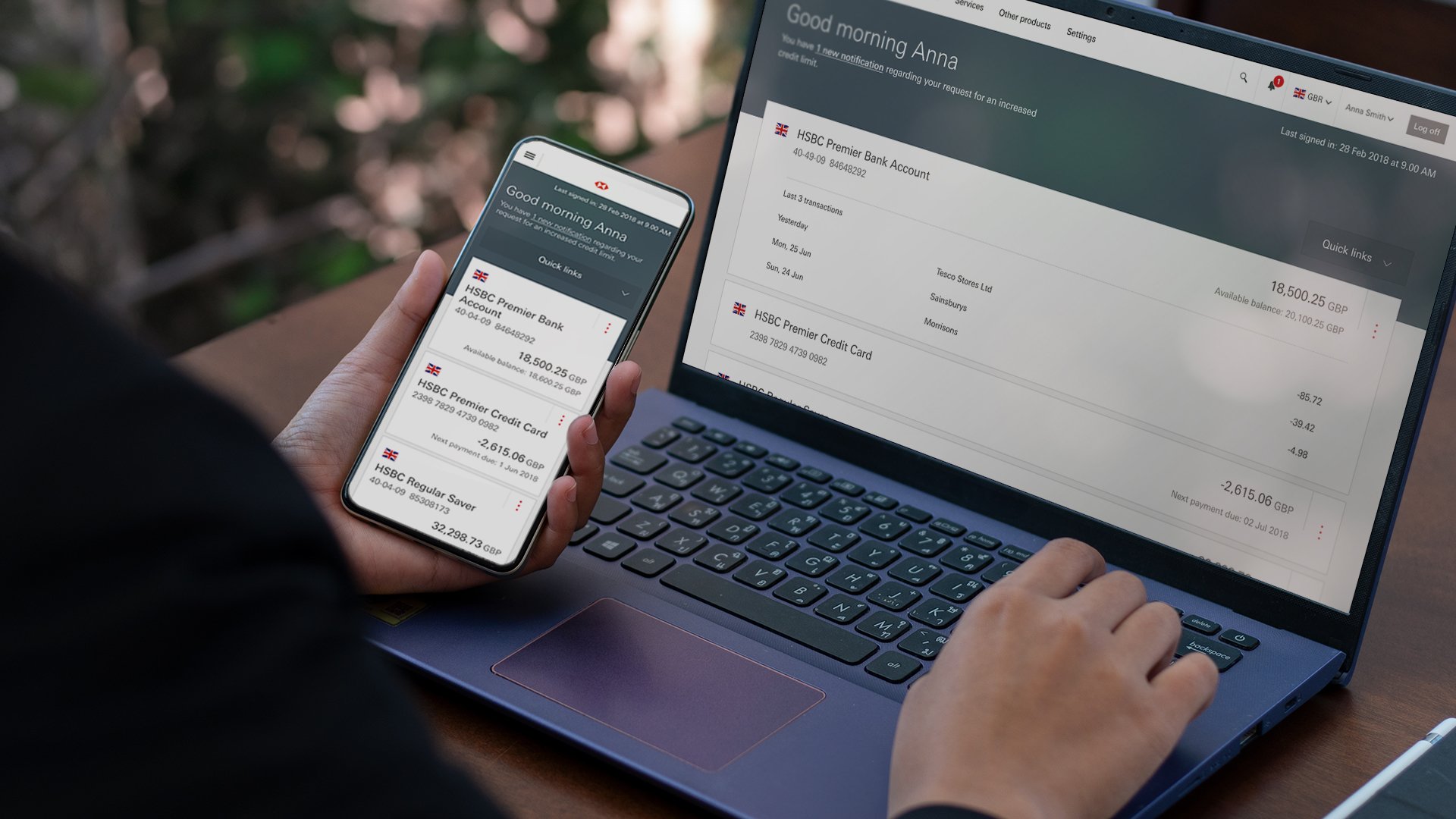
Account details
When the customer taps on an account from the home page they are taken to the account details. Here we needed a screen that would work for any account types and enable the customer to complete tasks on that account. We created new features including reporting suspicious transactions.
Baseline UX & Core build
From the MVP wireframe onwards the Home Page tested well all the way through the project, we then took that baseline minimal product UX into build. This meant working towards having a first draft of a core build. We built in 2 week sprints ironing out issues as we went. We then accessibility tested the MVP with ability net and made any tweaks needed.
Future thinking
We then set to work on new features working our way out of the minimal viable product into something more rich. We ran customer test cycles every 6 weeks across 3 different countries and multi customer segments to get a good cross reference of feedback. Over time we added features and changed them to suit the country.

Global rollout
From here the home page is being rolled out for customer use around the world. We then worked on what the delta was, this is the difference between the core build and any customisations a particular country may need to meet their banking culture and standards. Feedback has been positive.
62
Countries
40m
Customers
10m+
Visits globally per day

Personal learning
Over a year in the making and also including being the UX representative to travel to India twice for PI Planning with all build pods from the tech team, the project was the largest I have worked on to date, the most influential and global. My own team working and multi-tasking skills matured with this project, working under security clearance for the first time.


